
If you have ever sat in a Monday morning meeting trying to answer the question “is the team okay?”, you already know the limits of every project management tool you have used so far. Task counts lie. Story points lie. “Yeah, I’m fine” in a one-on-one lies even harder. You walk out of the room with a feeling, not data — and a week later, somebody quietly burns out, somebody else looks unproductive when they were actually blocked, and the manager gets blamed for not seeing it coming.
The brand-new Qanban Utilization Report is built to end that guessing game. It turns the audit trail you are already generating — assignments, status changes, allocation ratios, working hours, break periods — into a single, honest picture of how every person on your team is being used, day by day, across every project they touch. No extra plugin. No upgrade tier. No timesheet to chase.
This is the second pillar of the Qanban reporting suite, following our Qanban Timesheet release. And like the timesheet, it comes with your account.
The Real Pain: Managers Are Flying Blind on Capacity
Capacity is the single hardest question in modern project management, and almost every tool gives the wrong answer.
- Jira counts assigned issues out of the box. Effort-based or capacity-based workload views are typically delivered through paid add-ons such as Tempo or Structure.
- Asana offers workload views from the Advanced plan and above, with effort calculated from manually entered fields per task.
- Monday.com ships a Workload widget on the Pro plan and a fuller Resource Planner on the Enterprise plan, both driven by numeric columns that have to be filled in.
- ClickUp offers a Workload view from the Business plan and above, calculated from capacity numbers entered manually per task.
The shared limitation across these models is structural: they depend on manually entered estimates. Someone has to remember to fill in the field, and in real-world use that discipline fades — which means the workload view tends to get less reliable over time, not more.
Meanwhile, the actual signal you need is already sitting in your project tool. Every status change is timestamped. Every assignment has a start, a stop, and an allocation ratio. Every working day has a defined start, end, and break window. The math has always been there. Nobody bothered to do it.
Until now.
What the Qanban Utilization Report Actually Shows You
Open the report, pick a date range up to 30 days, hit search, and you get three things at once:
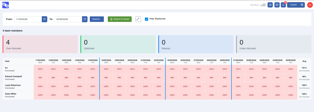
1. The Team Pulse — Four Counters That Tell You Everything in One Second. At the top of the report sits a clean strip of four cards: Over Allocated, Optimized, Balance, and Under Allocated. Before you read a single name or a single number, you already know whether your team is healthy or on fire. Two people optimized, one in balance, zero overallocated? Good week. Three overallocated and the rest underloaded? You have a distribution problem, not a capacity problem.
2. The Day-by-Day Matrix — A Heatmap of Reality. Below the counters is the grid that does the real work: every team member down the left, every day across the top, every cell painted with the actual percentage of available capacity that person spent in active work. Cool blues for underloaded days, soft greens for optimized, warning reds for overallocated. You can scroll a fortnight in seconds and instantly see who is drowning, who is coasting, and which days went sideways.
3. The Profile Label — A Verdict, Not Just a Number. On the far right, each user is given a one-word profile based on their rolling average: High Performer, Steady Contributor, Overloaded, or Underloaded. This is the line that turns a spreadsheet into a conversation. “Tester One is sitting at 88% and trending optimized” is a coaching opportunity. “Tester Two is averaging 74% in balance” is a green light to give them the next initiative.
The Four Utilization Bands — And Why They Are Calibrated, Not Arbitrary
Most workload tools draw a single red line at “100%” and call it a day. That is not how knowledge work behaves. Real human productivity is a curve, not a switch, and Qanban codifies it into four evidence-based bands:
| Band | Range | What It Means |
|---|---|---|
| Underallocated | Below 50% | Capacity sitting idle. Either a blocker, a coverage gap, or a hidden bench. |
| Balance | 50% – 79% | Healthy, sustainable load. Room to absorb a small new ask. |
| Optimized | 80% – 94% | Peak productive zone. Person is fully engaged but not drowning. |
| Overallocated | 95% and above | Red line. Any new request will displace existing work. |
These are not numbers somebody guessed in a planning meeting. They are derived from the intersection of assignment windows and “Doing” status windows, multiplied by the user’s allocation ratio, divided by the net working minutes of the day — break time excluded. If a team member is assigned 50% to Project A and 60% to Project B, and both items sit in “Doing” all day, the report will surface that as 110% allocation without anyone having to flag it. That is what an overallocation alert is supposed to look like.
Why Qanban’s Workload View Is Structurally Different
The Qanban Utilization Report has three structural advantages over the manually-entered-estimate model used by most workload tools today.
It is automatic. No engineer is filling in a time field. No project lead is updating an estimate. Every number is derived from data your team is already generating in the course of normal work — opening a task, moving it to “Doing”, being assigned to a project, finishing for the day. The compliance burden is zero, which is the only reason the data will ever be accurate enough to trust.
It is allocation-aware. A person at 50% allocation completing five stories is not the same as a person at 100% completing seven — and Qanban’s math knows that. The utilization percent on every cell is scaled by the assignment’s allocation ratio, so a part-time contributor on multiple projects shows up correctly, not double-counted.
It is break-time-honest. Most tools compare hours worked against an eight-hour day. Qanban subtracts your configured break window from the denominator, so a 90-minute lunch policy does not silently make every developer look 18% lazy. Your working day definition flows into every percentage on the screen.
How the Report Plugs Into Real Manager Decisions
A utilization report is only valuable if it changes what you do on Monday morning. Here is how managers are already using it.
Hiring decisions. Before going to leadership and asking for headcount, open the report. If half the team is sitting in the Balance band and one person is consistently Overloaded, the answer is not hiring — it is redistribution. If everyone is Optimized or Overallocated across a four-week window, you have the evidence you need to make the business case.
Incident response. A production issue lands. You need to pull someone without derailing committed work. The matrix tells you in five seconds which team member has the lightest day, which one has been in Balance all week, and whose Friday is wide open. No more interrupting whoever answers Slack first — that person is almost always the one who is already overloaded.
One-on-ones with intent. When a top performer’s trend shifts from Optimized into Overallocated for three weeks running, that is the conversation to have now, not after they hand in notice. When a newer team member moves from Underloaded into Balance over a month, that is a ramp story to celebrate. The report gives you the signal long before the symptoms appear in retros.
Project staffing. When stakeholders ask “can we add this initiative?” the right answer is no longer a vibe. Pull the last 30 days, look at the Optimized count, find your candidates in Balance, and commit to a delivery date you can actually keep.
Built-In, Not Bolted-On
Here is the part that consistently surprises teams evaluating Qanban: the Utilization Report is included on your existing plan. No paid module. No “talk to sales” tier. No third-party marketplace plugin charging you per user just to see your own data.
Compare that to the market:
| Capability | Jira | Asana | Monday.com | ClickUp | Qanban |
|---|---|---|---|---|---|
| Workload / utilization view | Paid add-on (e.g. Tempo) | Advanced plan and up | Pro plan and up | Business plan and up | Included on base plan |
| Per-day allocation matrix | Paid add-on | Advanced plan and up | Pro plan and up | Business plan and up | Included |
| Allocation-ratio-aware math | Not documented as standard | Not documented as standard | Not documented as standard | Not documented as standard | Yes |
| No manual capacity entry required | Manual entry | Manual entry | Manual entry | Manual entry | Yes |
| Break-time-aware calculation | Not native | Not native | Not native | Not native | Yes |
| Excel export | Paid add-on | Advanced plan and up | Pro plan and up | Business plan and up | Included |
| Timezone-aware daily grid | Paid add-on | Partial | Partial | Partial | Included |
Comparison based on each vendor’s publicly published pricing and product documentation as of June 2026. Vendor plans and feature availability change frequently — please verify current pricing on each vendor’s website.
A mid-sized team on Asana’s Advanced plan (published at around USD $30 per user per month, billed annually, as of June 2026), or on Monday.com’s Enterprise plan to unlock the full Resource Planner, is paying five figures a year for a view that Qanban ships with the base account. The features you need to run a team are not luxury upgrades. They are the product.
Get Honest About Capacity. Get Started Today.
Capacity guesswork is expensive. Every overallocated week buys a future resignation. Every underused contributor erodes margin. Every blocked engineer who looks “idle” on the count-based dashboard is a coaching mistake waiting to happen.
The Qanban Utilization Report gives you the one thing every other tool refuses to deliver without an upcharge: a truthful, automatic, allocation-aware picture of who is being used well and who is not — refreshed every time your team moves a card. No plugins. No premium tier. No timesheet to police.
Open Qanban, navigate to Reports, pick your date range, and find out which conversation you should be having on Monday morning. Stop running your team on feelings. Start running it on signal.
The Qanban Utilization Report ships as part of the standard plan. This first release covers per-user, per-day utilization with team summary and Excel export. Flow efficiency, focus score, throughput velocity, and stale-work detection are on the roadmap and will roll out to all accounts at no additional cost.